September 3, 2011
Editing 101
In case you haven’t figured it out already, I love editing. And I love good editing. In fact after having nice equipment and a good eye, I believe having good editing skills are what really make a photo pop. I’m not the best at editing, and I’m still getting better at it every time I edit. And I don’t have any editing software, but picnik.com has become very useful. I wanted to share so major before and afters. A lot of the pictures I take only take a small amount of tweaking, but every now and then a certain picture needs a lot of help and it ends up looking sooo much better.
The first one I’ll share was taken a week ago when we went camping on the Chesapeake Bay. And I’m using this one for:

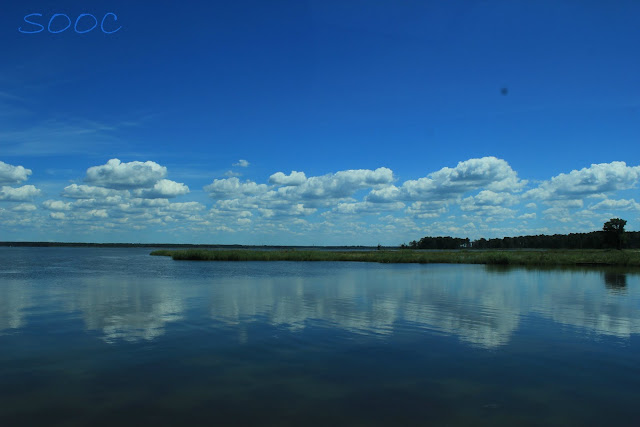
While we were driving over a bridge I snapped this photo through the car window:
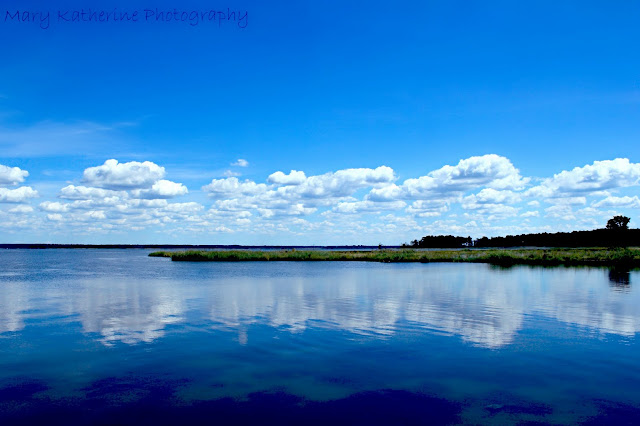
I loved it when I was looking at it on my camera, but I knew I could make it better with some editing. And I was right. This is what happened after editing:
I don’t remember exactly how I edited but I’ll try to go over everything:
1) I used the clone tool to get rid of the black spot in the upper right corner (from the car window)
2)I then adjusted the levels until I liked it.
3)With the levels adjusted I realized the overal image had too much green in it, so I went back to levels and clicked on the green, and changed the green level to allow for more blue and white.
4) I then played with the blue levels
5) then I used the sharpening tool to sharpen the clouds, reflection and grass
6) I used the airbrush tool to smooth over the sky
7)lastly I added my watermark
The next photo is my two youngest brothers, Ben and Joe {4 and 18 months}, and was taken in July in our kitchen which has horrible lighting. SOOC:
The image was too red, noisy and dark. After editing:
Much better! Basically I follow the same pattern for each image:
1) adjust the levels until the image looks right
2) adjust the colors until the colors are natural
3) brightened their eyes
4) airbrushed the background on “strong” to get rid of most of the noise
5) airbrushed their skin on “light” to smooth it out and lose any noise.
The last photo I’ll share is the most recent one, taken just a few days ago and you should recognize it from my last post. SOOC:
A nice picture, but lacking the “POP” that should accompany great images.
After editing:
Basically I:
1) played with the levels
2) played with the colors (warmed them up)
3) then decided I wanted them a little warmer, so I used the cross process tool at I think 85%.
4) I sharpened her clothes and the umbrella
5) I lightly airbrushed her skin
6) I strongly airbrushed the background
7) I added my watermark.
Thanks for looking!
~Mary Kate




Your edits on all three shots are absolutely wonderful. I am totally in love with that first shot! Great job.
I can't believe you took that first one out of the car window! Amazing photos.
Share Post:
2 Comments on Editing 101