


May 18, 2020
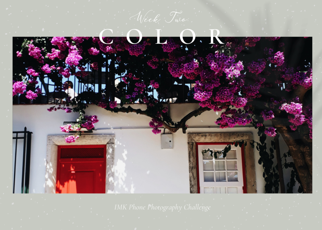
Week Two we are diving into COLOR because color is one part of photography that is often forgotten. But learning a few basics about color theory and then implementing them into your photography will make a huge difference in your images. There are three main “relationships” between colors that create the most pleasing color combinations.
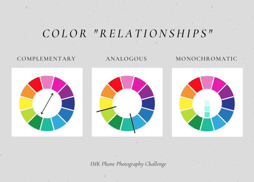
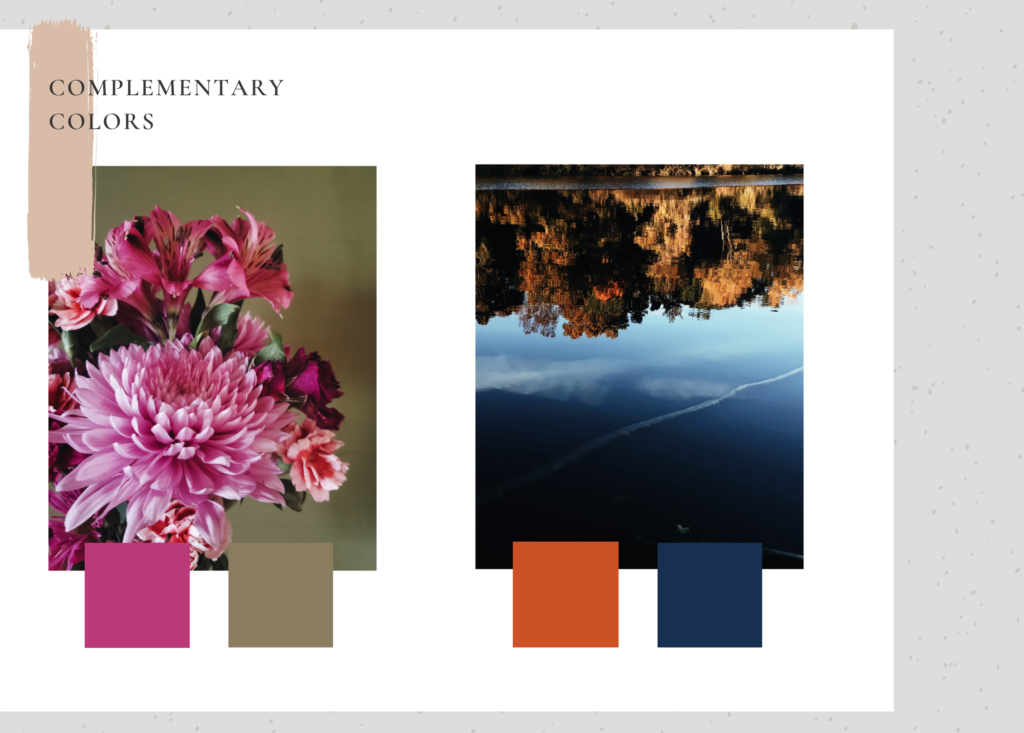
Complementary
Complementary colors lie opposite each other on the color wheel and they create strong contrast without competing with each other. Complementary colors balance each other out and just feel right together when we see them.
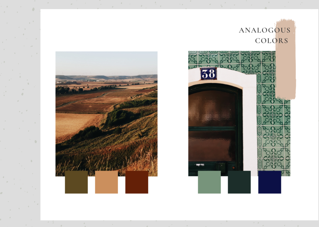
Analogous Colors
Analogous Colors are adjacent to each other on the color wheel and share similar colors. They create low contrast harmonious color schemes.
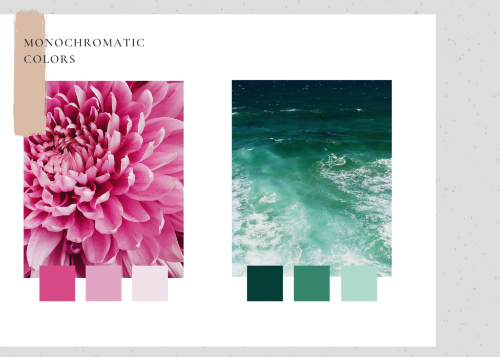
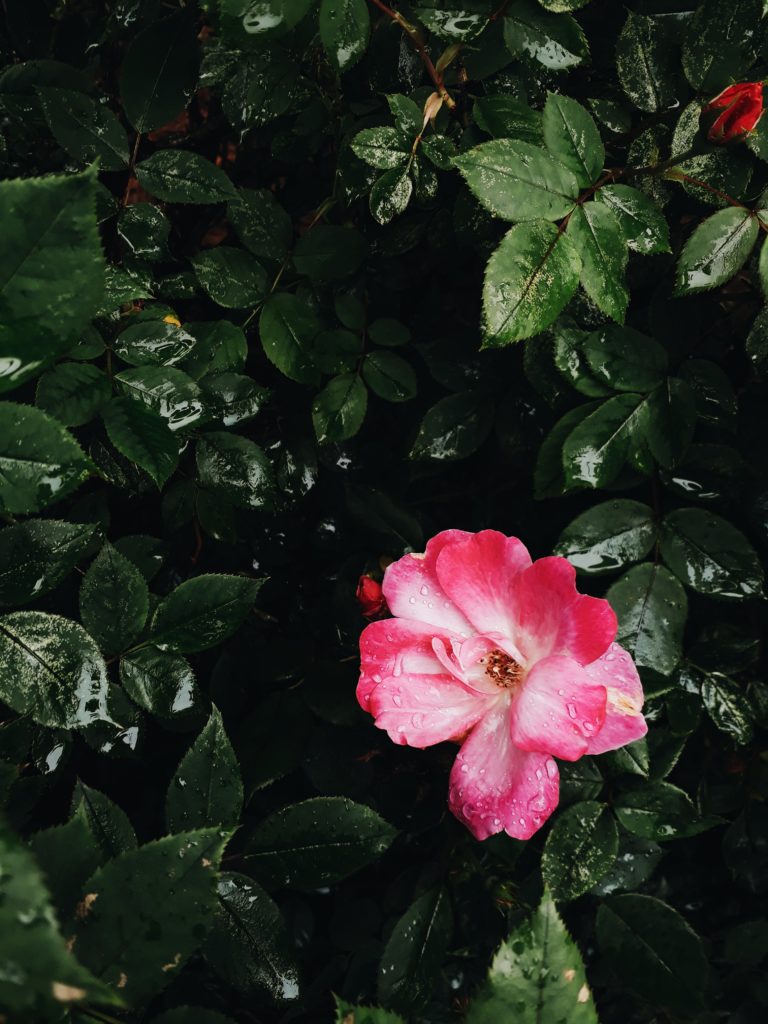
Monochromatic Colors
Monochromatic colors are not only black and white, they actually are just the shades of one color, but that can be any color. Monochromatic colors are low in contrast and often create a soothing mood. Monochrome is useful for images in which you do not want a single element to stick out.
Color Story
A color story is using a series of colors to tell a story to the viewer. It is often used when curating different images for a website, magazine, art show, or an instagram feed. But you can also have a color story in a single image. In simple terms, you notice the main colors that tie together a group of images, and then you avoid adding any images that distract from the main colors.
To use a color story in a single image, you want to notice the main color palette in your subject/background and then avoid any colors in the background or foreground of your image that are not a part of your chosen color palette.
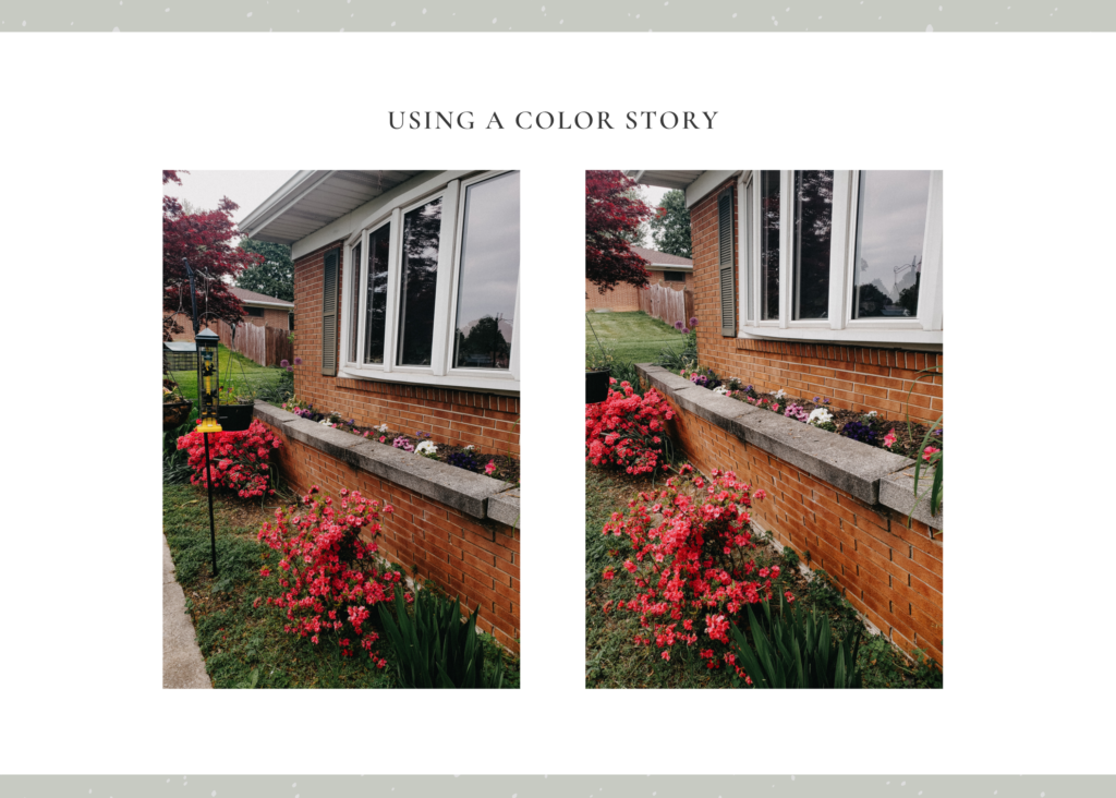
In the example above, the main colors are the pinks and purples of the flowers and the bright yellow bird-feeder is a distraction because the pop of yellow steals our attention away from the flowers.
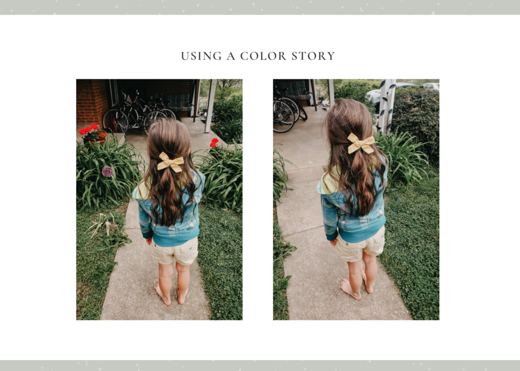
Another example, the red flowers add a pop of bold color and sharp contrast to the yellow and blue my sister is wearing. If I want the viewer’s attention to be on my sister’s yellow bow and shorts, then I want to avoid adding the distracting red flowers into my image. They are very pretty but they take the viewer’s attention away from the yellow & blue colors. Try covering up one of the images above at a time to see what I mean.
But aren’t multiple colors a good thing? Yes of course! And the yellow bow actually would look quite nice next to the red flowers if I wanted to go for a high contrast photo, however, my intention was to have the attention 100% on the yellow bow & shorts and so the red flowers end up as a distraction.
If my sister was wearing a white top for instance, and I wanted to put her with the red flowers, then I would want to avoid the purple flower in the left image because the purple would be distracting from the reds & yellows.
Don’t Worry!
If you are feeling overwhelmed at all, don’t worry! First of all, you probably already instinctively know what colors look good together. Secondly, this week’s lesson and challenges are simply designed to help train your brain to notice color relationships and color stories a little more so you can avoid distracting colors (if you want to).
These are the two challenges for this week:
- Highlight 2-3 complementary colors in a picture for a striking contrast
- Take a picture that shows off monochromatic or analogous colors.
If you want to participate, all you have to do is share the images you take for one or both of the challenges on Friday on Instagram or Facebook and tag me in them!
I can’t wait to see what you all create!
Xoxo,
Mary Kate
(Last week’s theme was LIGHT and you can read all about here.)
Comment

Mary Katherine truly captured our whirlwind and glorious day with flawless professionalism and artistry.
"The exuberant joy of the candids, the elegance of the portraits, the regal and sacred shots of our wedding mass, all of it is simply breathtaking.
- Rose + Jeff
FIVE STAR REVIEW:


Share Post:
Be the first to comment